Acorns Children’s Hospice
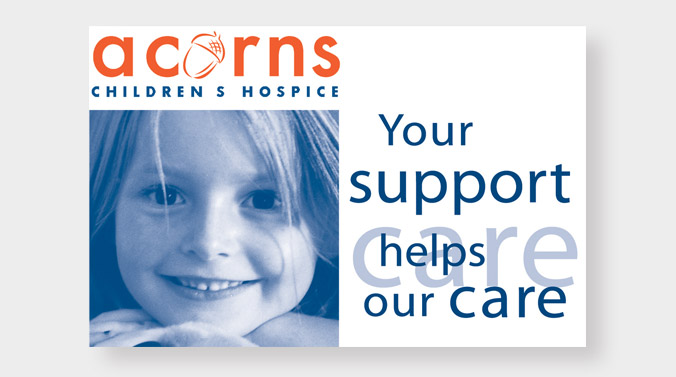
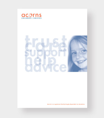
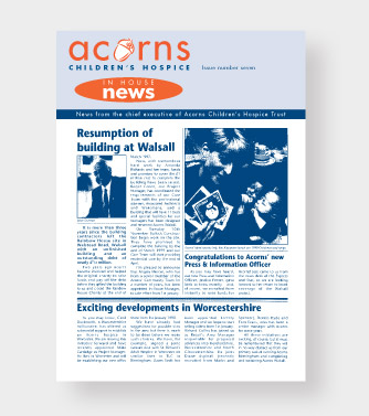
There should always be a core objective for any brand initiative. In the case of Acorns it was to align the core funding mechanisms that support the charity’s delivery of service, to children with life limiting illnesses.
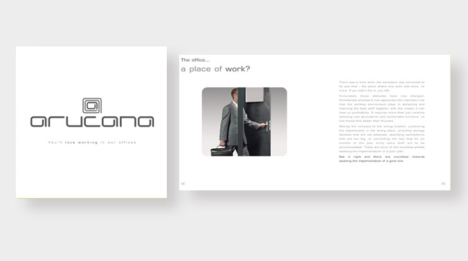
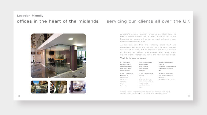
Arucana
To create a unique word-mark that positioned Aracuna as a contemporary office interior consultancy.
The Bucklemaker Restaurant & Bar
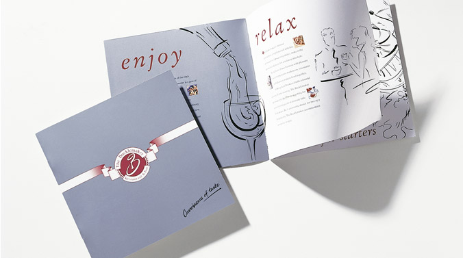
A fresh image designed to attract a wider audience.The new identity was applied to signage,brochures,menus and a regional advertising campaign.

Male Building Services
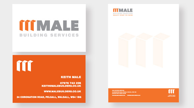
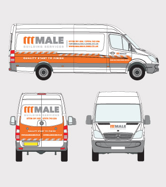
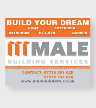
A good builder will interpret architects designs and be instrumental in the creation of a structure that will last for many years.
CCC was the architects for a more cohesive strategy in how Male builders presented themselves.
They now have a strong identity that is both credible and informative in their approach to doing business.

Savage Plant Hire
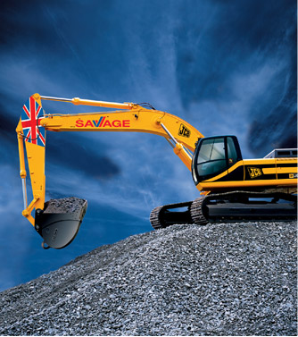
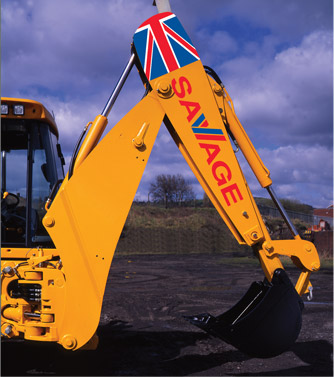
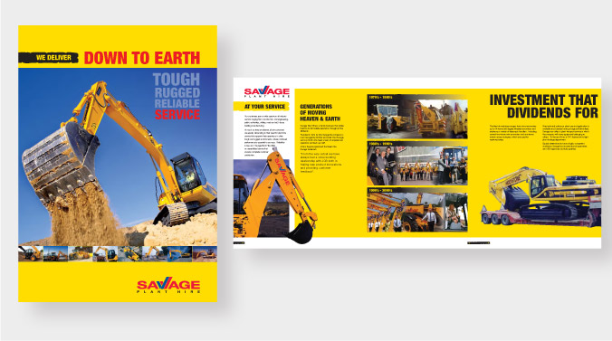
A well-testablished Midlands company, Savage Plant Hire commissioned CCC to create a new identity. Part of the requirement was to create a word-mark to reflect quality and British industry.

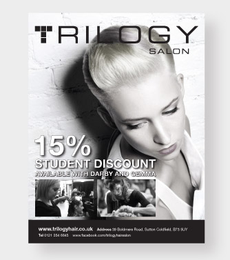
Trilogy Salon
There is an art to cutting hair just as there is an art to how a new business gets a head start from day one.
Alexa, Lorraine and Gill decided to go into business together they wanted an identity that made them stand head and shoulders above the competition.
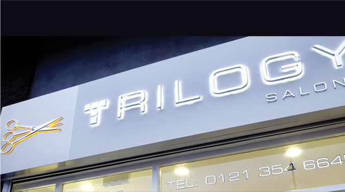
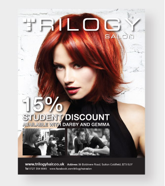
CCC created a suite of brand material including DVD of services, shop signage, press adverts, e broadcasts and a website.
The Trilogy identity is a valuable asset in retaining customers and attracting new business.

We Do Jobs
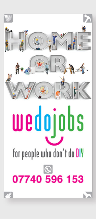
When you are changing career direction and starting a new business you need to hit the road running.We created the name and identity for a new company that is all about doing the type of domestic jobs that most of us haven’t got the time or inclination to tackle.

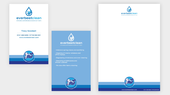
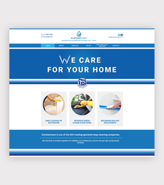
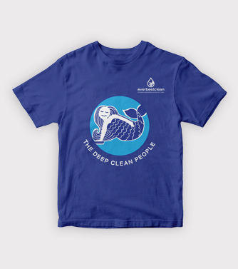
EverbestClean
Our brief was to create a new name and brand identity for a company that specializes in domestic deep cleaning. The core of the business is the renovation and revival of kitchens and bathrooms both of which come into contact with water and the constant battle with lime scale.
Our work has involved name creation a master brand and sub-branding. The mermaid icon was chosen as a good visual metaphor for deep cleaning in water.
